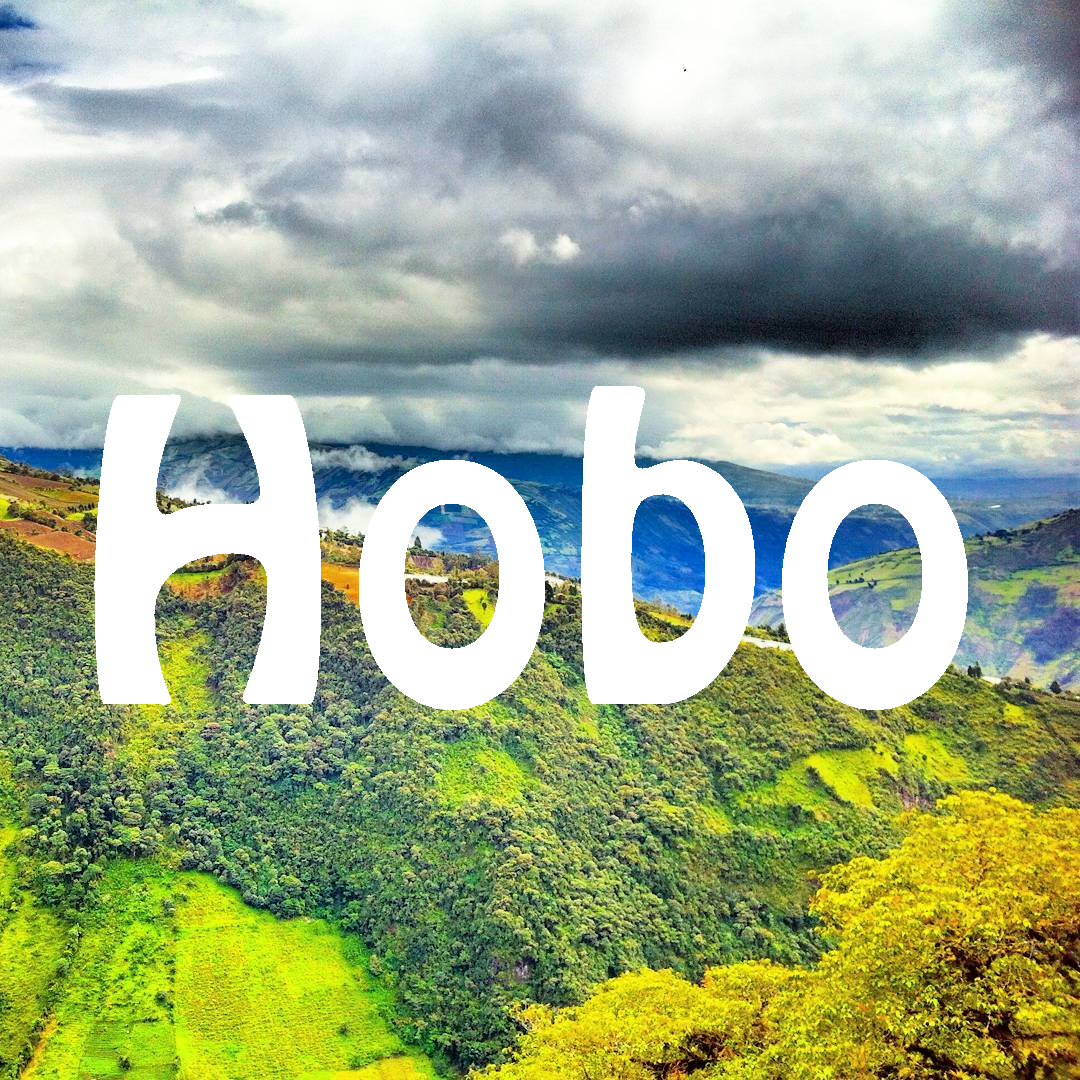
Perhaps you think I’m imagining things, but I swear by it: Ecuador has a national font! And that font is Hobo.
It all started when I entered Ecuador from Perú. My first place of visiting was Nuevo Rocafuerte at the Napo river. While I hadn’t noticed the presence of this particular font yet, I did notice some other odd typeface choices; ‘Hostal Chimborazo‘ written in the Harry Potter font.
Next up I went to El Coca, where Hobo had fully penetrated society and replaced all competition. Everything came in the form of Hobo. Whether it was a menu on the street or a giant sign indicating a car wash, it was in Hobo. Funky and strange, but perhaps a very localized phenomenon. That was until I went to Tena. The freaking doormat of my hostel welcomed me “HOME” in with that weirdly specific ‘O’. Now we know…

Do you know how the font Comic Sans is everywhere in the rest of the world? Hobo is the Comic Sans of South America. It’s both heavily overused and sometimes applied inappropriately. A short history of Hobo:
Unlike Comic Sans, Hobo is very old. Like, more than a fucking century old. 1910 is the official birth year listed on Hobo’s Wikipedia page. It’s so special because everything is curvy and it’s hell to imitate by hand. All letters change drastically when you compare the lowercase with their uppercase counterpart, but still it looks OK. It’s playful but not childish. Though not confined to that era, it kind of has a seventies vibe. It’s striking but it doesn’t scream at you. And you can hate and love it at the same time.
It’s sometimes standard available in popular computer programs, which increases the chance of a font going into overuse. The overuse of a font can be highly localized as well. Whereas most of the hobo-haters apparently live in the USA – where it was used extensively for a while – I don’t recall it ever being used on a grand scale in the Netherlands. The reason I recognize it is because I’ve used it in parts of my website before I discovered Canva for my design needs. And yes, at first I chose it because of the name—whether it’s supposed to refer to homeless people or the Russian word “ново” (“new”). I love it.
So why did it take off in Ecuador? My theory is that the print shops that make banners for businesses put the font in their shortlist for clients. For non-designer folks who need something for their business, they need to keep it simple. When you’re selling grilled plantain with cheese from your food cart, all you want your sign to do is be readable, convey what you’re selling and not be too serious. Hobo stands out.
Another reason might be that writing in Spanish requires special diacritic marks like ~ in the letter ñ, all the vowels that need accents in certain cases like á, é, í, ó and ú, and of course the ¿ and ¡. Not all font sets are complete enough to include all these symbols. This makes Hobo the font of choice in parts of the Spanish-speaking world.

FYI this isn’t Spanish. Courtesy by Typekit.com
I’ve been having a great time in Ecuador spotting Hobo everywhere and I might have discovered that its overuse is not limited to the confines of Ecuador. I just arrived in Colombia and I’ve been seeing it a great deal in the south as well. Perhaps if it’s also widely in use in Venezuela I can officially propose a relation to the former state of Gran Colombia. In that case, I’d say that the constitution should mention the font as a multi-national symbol and probably renamed to Hobolívar…
Jokes aside, South America – and the rest of the world – is a treasure trove for odd or funny font choices. Regrettably, I didn’t take photos of them all. When in the Peruvian city of Pucallpa I spotted loads of mototaxis with motivational text on the back. A bunch of them said, “Jesús te ama” (Jesus loves you) in… a horror font! 😂

Written in Shlop. Stay classy, Zombie Jesus.
I don’t know I’ll ever find a better example to illustrate the power of font choice. In the meantime, I hope to see loads of Hobo in Colombia. I’ve even resorted to trying to write a hitchhiking sign in it myself! 😀 Whatever, judge me.

I truly did my best. This is my best.
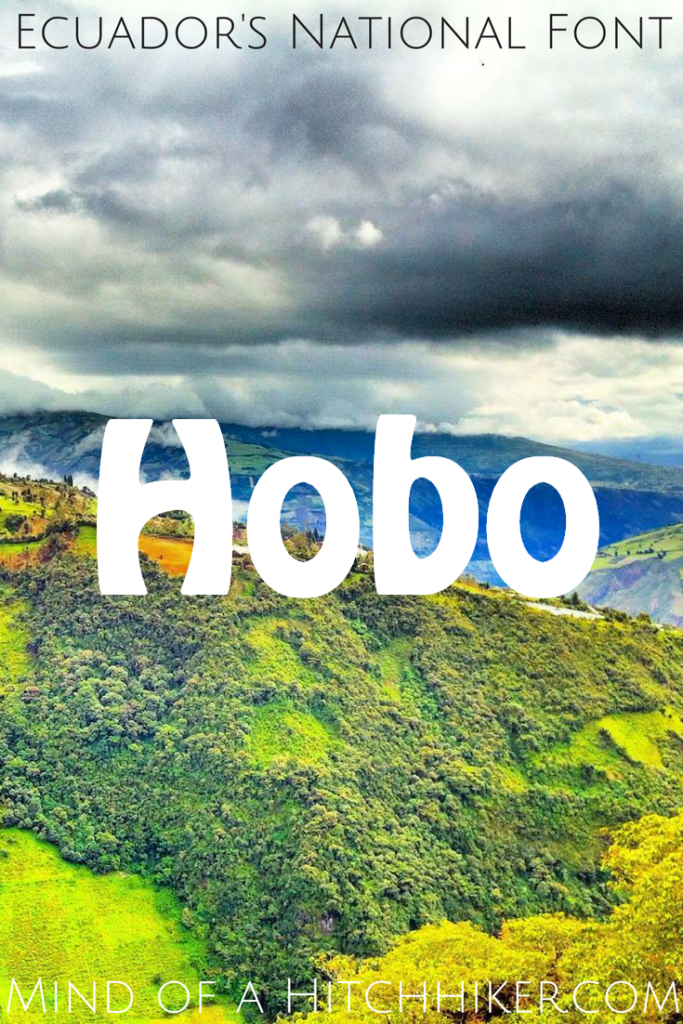
Enjoyed this? Pin me! 😀











Wow! Stunning pictures and an amazing post! What are your highlights of Ecuador?
I didn’t know font example texts can be stunning but OK 😉 Quilotoa was definitely a highlight of Ecuador! There’s also a post about that 🙂